What is it about the 80s logos that were so eye-catching? Well almost everything you could think about really. Today’s logos are bland and colorless. Unlike the old 80s logos that featured plenty of colors, shapes and plenty of flare.
80s Logos Were and Still Are The Most Eye-Catching
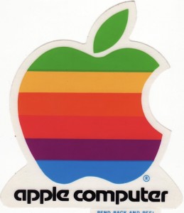
Let’s talk color. Color was one of the most important and standout aspects of these logos. The 80s Apple logo makes the current one look like the fun was completely sucked out of it.
Now, the logo stands as a bland grey apple. The company is going for a clean look but it would be nice to see a rework that pays homage to the 80s style.
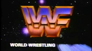
Then there is that awesome metallic feel you get. Before it was called the WWE, the World Wrestling Federation reigned supreme with it’s colorful superstars. Their logo was also quite eye-catching and featured a signature 80s metallic look.
The WWF isn’t the only one to use this method either. Think about the look of Transformers and Tron. There were plenty of metallic and neon notes that happened to be a staple in plenty of 80s logos.
The playful nature of 80s logos shows that it was all about the flare. These companies, corporations and TV networks knew that they had to create a lasting impression on the consumer or viewer. The creativity ran rampant all over and today, it seems like everyone is worried about looking extra professional.
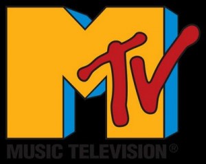
How about some old school logos like the MTV one below? Is a little color too much to ask these days?